This is in response to Jono's great post on Radial Menus.After seeing Microsoft's approach to contextual commands in Internet Explorer (Accelerators) and Mozilla's approach in Firefox (Ubiquity) I was dissatisfied with both.
Accelerators
add yet another context menu (read: those annoying little paste icons in Word). Plus it doesn't scale well with a large number of commands.
Ubiquity
does not denote context. I.e. you're translating
the selected text from French to English. So why do you do this in some bizarre off-in-space mode? Also, Ubiquity is invoked in an unintuitive way by pressing Ctrl+Space.
I think Jono mentioned that he was contemplating the effects of combining the Awesomebar and Ubiquity when I talked to him at the Toronto MozDevDay two months ago. Regardless, I think this evolutionary idea would be the wrong approach for two reasons. 1. UI overload (awesomebar vs ubiquity == search for an object vs do something to an object). 2. Still wouldn't denote context.
Just for clarification, context and situation are important because you can hide features the user doesn't need and show them when the user needs them. As well, context is partially derived from how close in proximity things are grouped together – aka visual context.
Before I explain my solution, let’s go over what's been stated in the comments so far.
Requirements
1. A radial menu is faster to physically click on something.
2. A radial menu is slower for visual scanning.
3. A radial menu doesn't scale.
4. A radial menu obscures things below it.
5. A radial menu doesn't work near the screen edges.
And my gripe:
6. Need to denote context.
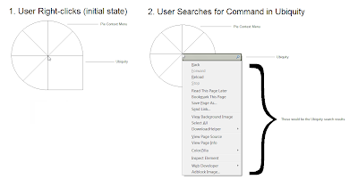
Solution: Hybrid Radial Menu

Search + Radial Menu = Hybrid Radial Menu
(I apologize for the ghetto mockup. I haven't installed Photoshop on my new laptop so I was confined to Paint.)
I think Ubiquity, along with radial menus, should replace the right-click menu in Firefox (aka the context menu).
The most frequently used commands are "pieces of the pie." One quarter of the "pie" is devoted to Ubiquity.
Satisfaction?
1. A radial menu is faster to physically click on something.
Using a radial menu satisfies Fitt's Law (as described in Jono's post).
2. A radial menu is slower for visual scanning.
Fitts law only takes into account the time to move from point a to point b. It does not address a human's ability to search a list. That said, this raises a few questions.
Are linear menus easier to search because our eyes have been trained over time to scan them efficiently (i.e. muscle memory of eye movements) or because our eyes naturally scan across and down (our DNA determines efficient eye movements)?
If we have been socialized, can we train our eyes to scan radial menus quickly too? This needs to be researched before investing more time developing radial menus. Optometrist anyone?
So. Search results (from Ubiquity) are displayed in a linear fashion, while the most frequently used items are shown in a radial pattern. Hybrid FTW!
3. A radial menu doesn't scale.
The most frequently used commands are "pieces of the pie" and any other desired command can be searched for using the Ubiquity "slice of pie." This approach also gets rid of the dreaded "More..." button and endless hierarchy of lists of lists of lists. Scalability solved.
4. A radial menu obscures things below it.
Yes, my hybrid radial menu does obscure things below it but I would argue that rectangular menus do as well. What happens if the user right-clicks in the top-left corner of their selection? In this case, the rectangular menu obscures the selection just as my hybrid radial menu would.
With that said, pointing out hypocrisy still does not solve the problem. I haven't thought enough about this issue but my first inclination would be to make the hybrid radial menu semi-transparent (even though that might decrease readability, but I don't think that's an issue considering icons would presumably be used instead of text for radial menus).
5. A radial menu doesn't work near the screen edges.
I got nothing ... maybe some sort of slide the page over and put negative space à la Fennec slide controls?
6. Need to denote context.
By placing Ubiquity in the right-click menu, there is strong visual context. Invoking Ubiquity finally makes sense! I.e. a user wants to do something to the selected text right here, so do it right there (pun intended), not off in la-la-land.
Conclusion
Thanks to Jono for an amazing post as I previously dismissed radial context menus on the basis of scalability alone. And any feedback on my design would be thoroughly appreciated!
